Sunday, December 18, 2005
Please No More Mockups!
There comes a time in the life of every new software project when mockups just don't cut it anymore.
I've observed that this time usually coincides with a period 1-2 presentations before people watching begin to wonder "these pretty mockups are all well and good, but when can I expect to see the real thing?"
For Ping, mockups have been an incredibly useful exercise. They've helped us to design, test, and rework major portions of our user experience (mainly UI + navigational paradigm), and to push additional requirements back into the web service that will power the project -- something much easier to do in Photoshop and Illustrator than Visual Studio!
But enough is enough, and it's time to move from mockups to code, and here's the plan for our next short-term milestone:
- I've begun to model our stack-based navigational paradigm in C# / .NET Compact Framework. When this is complete, we should have a completely navigable Windows Mobile application - though it won't be pretty, or functional.
- Jill is beginning to build .NET Compact Framework forms based on her amazing set of mockups.
- Jeff, from the mates project, is beginning to re-write the mates server proof of concept into production-quality C#/MS SQL code, taking into account a few changes/additions we've requested to the web service.
Ideally, once we've each finished our tasks, we'll have a pretty and functional barebones application, at which point we'll probably do another round of usability testing, and begin to bake in the necessary bells and whistles required to ship a beta.
Now back to living in Visual Studio for me...
Thursday, December 15, 2005
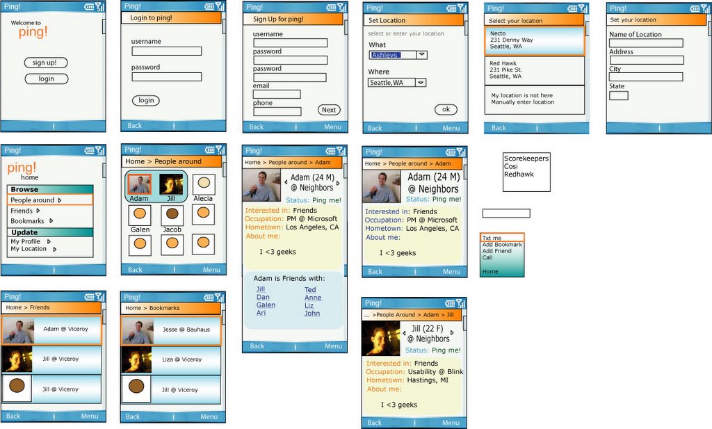
Updated Mockups

Okay I was eating for a long time - but here is the list of changes:
Global changes
- Navigation to next buttons
- Added contextual menus
- Blue for selected item in list
- Arrows on items in list
- If people are offline, pictures are grayed/more transparent and you cannot see their location, call, or text them.
- Instructions are across the top header
Set Location Form:
- What/Where changed to Venue/Area respectively.
- Drop downs will have New Venue and New Area in order to edit fields.
Ping Home
- Different color
- Expanded rows
People around
- Changed to list view
- Shows if friend of friend
- Shows if people are in same place by outline of picture
Person level
- Changed status to tagline (only shows a message, not online status)
- Displays pictures of friends of friend
- Displays if friend of friend
- Cleaned up visual treatment
Friends
- Added distance
Bookmarks
- Added distance
Thursday, December 01, 2005
Usability Testing 1 - Mockups
Usability Testing v1!
Well, the initial set of Ping mockups are about 70% done, and Jill and I have just completed preparing a paper usability test for my housemate, David.
Jill is going to administer the usability test (she does this for a living), and has asked that I sit silently and take notes on our findings. I agreed, under the condition that I could take the notes in a Blogger form and post them for all.
So, here goes...
Jill's introduction to David:
What we're gonna be testing today is a very early stage of our prototype. This is basically to confirm our concept, and also just to see if some basic functionality is somewhat usable.
We're going to be doing paper prototypes. So what I'd like you to do is use the pen as a mouse. So click on things, and I'll be the computer and give you what you should see next.
The general idea is while you're completing tasks, it'd be really great if you could think aloud so we could know what's going through your mind and know if you're on the same track as what we had imagined.
Everything is not fully implemented, obviously, it's paper. So, you'll definitely encounter some areas that do not work, that I will not have a screenshot for. So, I'll let you know if that happens. I'll just ask you what you expect.
Try to treat this as if it were an actual cell phone (this is a cell phone application). Imagine that all the controls work, and try to treat it like you normally would.
What's your age? 30.
What's your occupation? I sleep all day.
Who's your employer? The University [of Washington].
How often do you use your mobile phone? Like seven times a day.
Do you text message? Not really [might not be the best target user].
Have you ever installed an application to your cell phone? Do video games count? Then Yes.
Are you familiar with any social networking web sites? I have this dodgeball thing that I never use. And Friendster, MySpace, Facebook. I have an orkut account too, if you care.
So imagine a friend told you about this application called Ping. You know it's for your cell phone, but you don't know that much about it. You know it has to do with social networking.
So you went to the Ping web site and also read that Ping is an application that lets you read about and experience people who are around you. It is aware of your location, and therefor the people around you, and you can read their profiles and do a couple other things which you'll see in awhile. I think that's good enough, let's begin.
Now, moving from transcribing Jill's introduction to notes on the actual usability test results:
1. Start screen (fter installing and launching Ping)
Clicked Sign Up.
2. Sign Up screen
Entered username, password (twice), email, phone.
3. Location Selection screen
Confusion about "What" question on the "Where" screen. Suggested maybe "Where" and "City" instead of "What" and "Where".
Expands combo box.
Not sure how to enter a new location not in the list. Expects a "..." (or other) item, as opposed to replacing combobox items with his own text.
With guidance from Jill, typed in "Necto" (in "Ann Arbor, MI").
Clicked Next.
4. Location Confirmation screen
Clicked on the enter button to select the correct location corresponding to "Necto".
Suggested better (bigger) directions that indicated how to select ("press enter").
5. Ping Home screen
Hit Enter to select the menu item to browse nearby people (default selected).
6. People Nearby screen
Selects Adam (presses enter to select the default selected person)
Confused because only 2 have photos -- should fix mockup so all have photos.
Unsure why Adam and Jill have a blue background. Might just disregard that information at first.
7. Adam's Profile screen
"Oh, Adam's at Neighbor's. He's always at Neighbors."
"Whatever David, I've been there 3 times."
Thinks this screen looks good.
David is someone who usually checks all possible options. So he'd probably hit the menu button next.
David unclicks the menu, then wants to click on my picture to attempt to make it bigger (full screen).
Would click left/right buttons. Expects to see other people in the area.
Asks: What is considered next to me? What is the radius?
8. Jill's Profile screen
"Wow, Jill's always at Neighbor's with Adam."
I probably would log off now. Because now I know Adam and Jill are at Neighbors. So maybe I'd go there, or maybe I wouldn't.
Jill asks: Would you communicate with them? David responds, I probably wouldn't, because I haven't decided yet.
Jill asks: Suppose you went to Neighbors, and hung out there, and you want to add Adam as a friend.
David asks: What does adding him as a friend do for me?
Jill responds: Let's say you're curious about adding a friend.
David responds: I don't think I'd bother exploring that option if I didn't know.
David presses Back button, expecting to get to People Nearby page. In actuality, gets back to Adam's profile. Back Again -> People Nearby. Back Again -> Home Screen.
9. Home Screen
David notices there's a Friends thing. Makes it seem like he could keep track of friends or bookmarks. Assumes Bookmark is someone he's stalking. Friend is someone he knows is connected. Like Friendster.
To add Adam as a friend, goes back to People Around, selects Adam, selects menu, selects Add friend.
10. Add Friend Screen
Hits okay to add Adam as friend.
Jill: What do you think the notify option would do?
David: If... Hmm... [pause]... It could either mean if we're both logged on, then it would notify me that we're both logged on near each other. But the other idea would be if both of us are not logged on and happen to walk by each other. Yeah. But then that makes me think that Ping will know where I am at all times, even when I'm not logged on. So I'd be like woah, where's the privacy notice that I'm supposed to read for this part.
David expects to see a screen that confirms Adam has been added as your friend.
11. Friends Screen
David: "These are my friends!"
Jill: "What do you think about this page?"
David: "So, it tells me where all my friends are currently. I would hit the menu button."
David expects some choices to help explain what this page does.
David: "So when I add you as a friend, I would still have to wait for you to accept me, right? I would wait longingly for Adam to accept me as a friend."
David: "So if I bookmark, it would also say where my bookmark people are?"
Adam: "Why do you ask?"
David: "Then it seems like bookmark and friends do the same thing. I would know where people are, even if they weren't my friends. It'd seem like friends would be just an extra step that would have no extra features? Or are there extra features?"
Jill: "Suppose you wanted to put in a profile of your own, how would you do that?"
David hits back button and is returned to Home Screen.
12. Home Screen
David scrolls down and selects "My Profile".
David expects to find a page where he would enter his picture, and some fields for him to fill in.
David: "Where would I get my picture from?"
Adam: "Where would you want to get your picture from?"
David: "My laptop?"
Adam: "Would you take a picture with your phone and use that?"
David: "Yeah, I guess I'd be willing, assuming my phone had a camera."
Jill: "So you said you went to Neighbors. What do you think the implications are of changing your location to another place?"
David: "Assuming I closed my phone and put it in my pocket and went there, I'd probably forget about it."
Jill: "Would you assume you had to update it?"
David: "Yes, unless it had been explained to me otherwise."
Going back to Adam's profile screen for just a second...
13. Adam's profile screen
Jill: "What do you think about the friends list area?"
David: "I think it lists other people Adam has added as friends, and I could click on them to see their profile I guess. Oh, I just noticed, what is this status Ping Me mean? Is that something you can turn on and off? Or does that just mean that the person is near me?"
Jill: "What do you think it should mean?"
David: "If it just means he's near me, I already know that, so it doesn't give me any more information. But if it's the other thing, it means Adam's open to meeting people right now, and he could turn it off when he's feeling more private or something."
Jill: "What are your overall impressions of Ping?"
David: "I LOVE IT! Uhh.. I think it's an interesting idea that I probably wouldn't use as much because I don't do text messaging and those kind of things, or meet random people on MySpace."
Jill: "How would you describe Ping to a friend?"
David: "It's like Friendster on the phone... and instead of finding people who are closely connected to you, you find people who are close to you physically."
Jill: "Do you think that's of value?"
David: "Yes. Can I tell you what I would primarily use it for? If I was standing outside 2 bars right next to each other, I could see which one has hotter people in it before I pay the cover charge and go into the one without the hot people."
Jill: "Well thank you David. We'll buy you drinks sometime."
Well, that's the end of our first usability test. This was a really cool experience! Jill says on a scale of 1-5, 5 being most useful, this was a 4.5 because she thinks David illustrated some of our goals that weren't being met. She's not sure if our value prop was communicated effectively... "Oh, it's just another Friendster", when we do have a couple of additional pieces of information that we should illustrate more clearly.
We'll post mockups soon. Stay tuned. :-)